Artwork: Dry-Point Printmaking
|
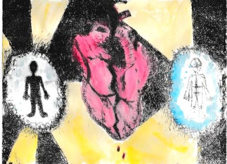
Title: Broken Exposure
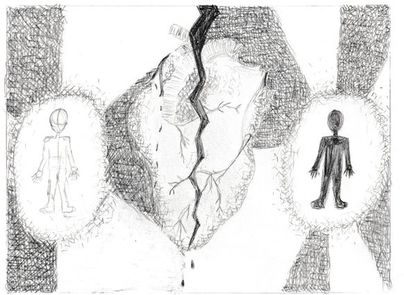
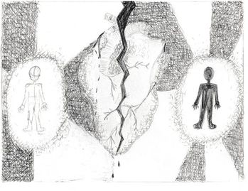
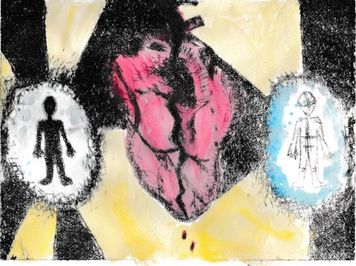
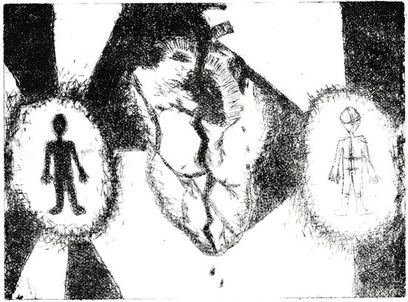
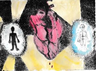
Size: 25.4cm x 19.7cm Medium: Dry-Point Printmaking Completion: November 2018 Exhibition Text Broken Exposure is an original piece of dry-point print, created with intaglio ink and water color. This piece illustrates the separation between the two parts of life: the beginning and the end. This piece was inspired by the use of flow and contrast in Edvard Munch's Separation and the use of line in Roy Lichtenstein's Sunrise.
|
Inspiration
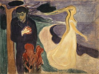
At this point of my life, I feel I am able to relate to the man feeling pain in Munch's Separation. Although, I am too young to feel the heartbreak that the man feels as the woman forces him to be stuck in his memories of her. Otherwise saying that he is stuck in the present. In my piece, I wanted to depict how I feel stuck in the present as well. I fell in love with the way that this painting flowed between the contrast of the man and the woman. Not only this, but I feel that this piece is very unified due to the two figures in the piece. I followed the proportion in my piece as well, as there is one figure on each side of my piece. Overall, I felt a strong connection with Munch's symbolization of losing a love, and feeling like you cannot move on towards the future.
Edvard Munch. Separation, 1896. Oil on
canvas. The Munch Museum, Oslo.
canvas. The Munch Museum, Oslo.
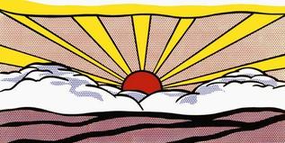
Another inspiration that helped me through this project was Roy Lichtenstein's pop art piece Sunrise. I feel that this piece depicts The vibrancy of the sunrise within this piece gave me the sense that there is hope for the chance of escaping negativity, and being able to escape from the present to move on with the future. His artistic aspects have always intrigued me, so I was excited when I found this piece to gain inspiration. This piece has good flow to it, as well as calming tones. What had really inspired me was his use of solid lines. It also helps that our mediums both require some sort of printing process.
Roy Lichtenstein. Sunrise, 1965. Offset lithograph on
lightweight, white wove paper. The Art Institute of
Chicago.
lightweight, white wove paper. The Art Institute of
Chicago.
Planning
|
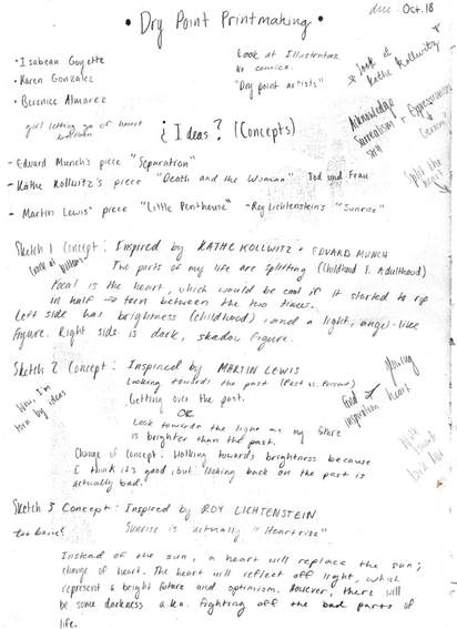
To begin my planning, I noted a few dry-point artists, and certain movements that could pertain to printing. I wasn't too interested in any of the actual dry-point artists except for Kathe Kollwitz and Martin Lewis, so I began thinking of my own concepts instead. After coming up with a few conceptual ideas, I decided to search through art movements. Within this time I was inspired by Edvard Munch and Roy Lichtenstein. |
|
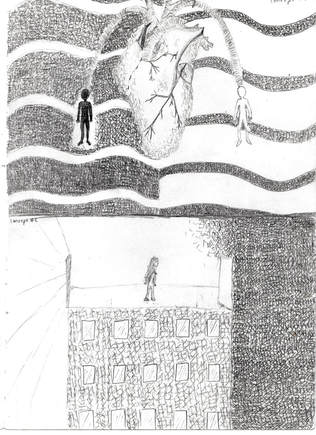
My first sketch (top) was inspired by Kathe Kollwitz and Edvard Munch, while my second sketch (bottom) was inspired by Martin Lewis. These sketches only required me to use a pencil to cross-hatch at different intensities, but for the most part I used the same amount of pressure to sketch out my designs. |
|
|
I followed the same exact cross-hatching procedure for creating my third sketch, except that I had taken my inspiration from Roy Lichtenstein. |
|
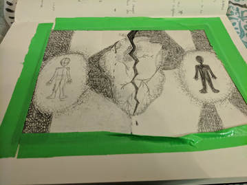
For this last sketch, I followed my intuition and traced my Plexiglas plate onto my sketchbook so that I could create my final piece. Once again, I proceeded to use the same cross-hatching technique. This turned out to be my final sketch, and it seems to be a combination between my first and third sketches. |
|
Process
|
To create my final piece, I used the cross-hatching technique to sketch out my ideas. This was my final approach to this project. |
|
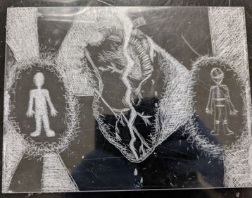
I taped my Plexiglas sheet to my sketchbook, so that I could inscribe into the plastic. The cross-hatching of my sketch helped me to be able to know where to carve in my designs. |
|
|
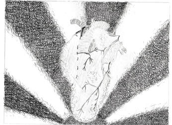
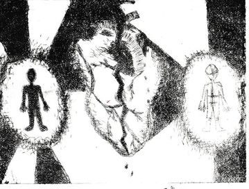
After using the dry-point etching tool, I was ready to begin the printing process. As can see in my etching, different parts of it have a deeper and larger amount of cross-hatching (ex. the sun beams and the figure on the left), because I wanted to create a higher contrast between the darkness and brightness of my piece. |
|
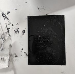
Before covering my piece with Intaglio ink, I placed a piece of newsprint on my work space so that the work area wouldn't get dirty. I also submerged a piece of watercolor paper about the size of my plate into a container of water for eight minutes. While I waited these eight minutes, I put a pair of gloves on and began to apply the ink on the inscribed side of my plate with a small squeegee. I made sure that every etching absorbed the ink so that I wouldn't have to reapply. Any excess ink that was left over on my plate or on my squeegee was put back into the ink jar. |
|
|
By the time I had the chance to rub the ink off of my plate, it was time to take the water color paper out of the water. I took my gloves off to remove the paper from the water, and place it on top of an old t-shirt to partially dry. While it was drying, I took strips of newsprint and began to rub the ink off of my plate in circular motions. I made sure to rub with slight pressure to remove the right amount of ink so that it wouldn't bleed. |
|
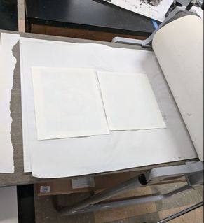
Once my plate was clear of the excess ink, I took my gloves off and moved onto the etching press to begin the printing process. I lifted the blankets and placed a new piece of newsprint on top of the press. Then, I placed my plate ink-side up, and placed the watercolor paper on top of it. I then put the blankets back on top of my piece, and rolled it through the etching press wit continuous movements. Once my piece was all the way through the press, I lifted the blankets to remove my piece and the newsprint paper. The watercolor paper was still damp, so I placed it on the drying rack, and began to clean my tools and work space with Mineral Spirits. |
|
|
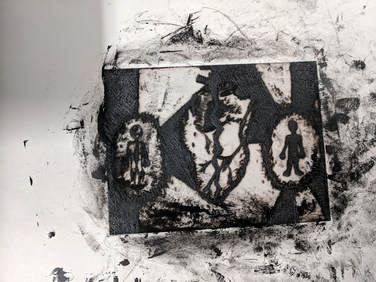
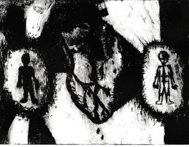
In this process, I completed two prints. Once my successful print was done drying, I decided that I wanted to add color to the piece so that viewers would be able to understand the piece easier. |
|
I used my own water color and brush to fill in my piece. I used my medium mop brush to fill in each section. I started off using cadmium red to fill in the heart, cadmium yellow to fill in the sun beams, and winsor blue to fill in the negative area surrounded by the figures. I let this dry for about thirty minutes, as the paint was still very watery. |
|
Experimentation
|
|
The print to the left was my first print, but I didn't like how the ink had began to bleed, and how intense it had become in general. The solution to this was to apply even more pressure to my plate while rubbing off the excess ink. However, my final piece lacked ink close to the bottom, but I decided that I liked my flawed version of my piece. These were the only two prints that I created. If I had wanted a print with an equal amount of ink, I would've restarted the process. But in this case, I didn't feel the need to do so.
Reflecting & Critiquing
|
Similarities:
|

|
Edvard Munch. Separation, 1896. Oil on
canvas. The Munch Museum, Oslo.
canvas. The Munch Museum, Oslo.
Differences:
- Neither pieces are a work of dry-point.
- Munch's piece was mainly the depiction of losing a love, but mine was about losing time within a life.
- Sunrise had warmer colors.
Roy Lichtenstein. Sunrise, 1965. Offset
lithograph on lightweight, white wove
paper. The Art Institute of Chicago.
lithograph on lightweight, white wove
paper. The Art Institute of Chicago.
Overall, I enjoyed the creation of this piece, but I did experience some downfalls. If I had the chance to recreate this piece, I would initially add more etching into my plate, because I feel like the heart had lacked some detail like shadowing, and contrast from the background. The ink process could've gone better as well, as I either had too much ink or too little ink. I also feel like the water color could've used a little less water. However, I chose to accept these faults, as I needed to slightly let go of my perfectionist attitude. If I wouldn't have done that, I feel that this project would've never been completed. I did have successes however, because I was really satisfied with my Plexiglas plate after the etching process. I feel that this project was a success in general, because I enjoyed everything about it.
ACT Connections
Clearly explain how you are able to identify the cause effect relationship between your inspiration and its effect on your artwork:
I had already known that Edvard Munch was a troubled individual, so I knew to look for his art when creating another personal piece. I was able to use the same symbolization in my piece, as well as the subtle color contrasts from his piece Separation. The other inspiration was only for artistic use, as I couldn't find the meaning of Roy Lichtenstein's piece Sunrise. I was able to use the same bold line pattern that he had use to create his print.
What is the overall approach the author has regarding the topic of your inspiration?
Edvard Munch's work always seemed bleak, as well as Separation, as he was trying to show how painful it was to be trapped in the present with useless memories of what he wanted.
What kind of generalizations and conclusions have you discovered about people, ideas, culture, etc. while you researched your inspiration?
I've come to terms that not all depictions need to be the same in order to get the same reaction from art pieces, as formations can still be similar. Artwork can connect to so many different topics.
What is the central idea or theme around your inspirational research?
My theme was based off of my own current feelings of my placement on this earth. I feel like I'm stuck in limbo; as if the transition between birth and death is worth nothing. As of this time, I just need to push myself further to reach a higher potential.
What kind of inferences did you make while reading your research?
I was able to infer that many artists were struggling with their own personal problems in this process. But I also inferred that not every similar piece has a similar meaning.
