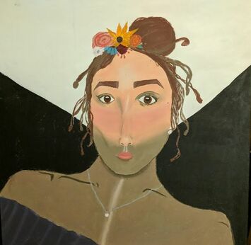
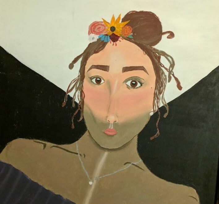
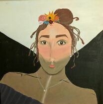
Self-Portrait
|
Title: Light in the Dark
Size: 91.44cm x 91.44cm Medium: Acrylic paints on canvas Completion: April 2019 Exhibition Text Light in the Dark is an original painting of acrylic on canvas. This self portrait is supposed to show a rise out of darkness in the worst of times. This piece was inspired by the use of color and balance in Frida Kahlo's Self-Portrait II (Dedicated to Dr. Eloesser) and the use of lines in Leonardo Da Vinci's Head of Woman. |
Inspiration
|
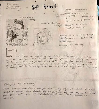
Starting my self-portrait consisted of gaining an understanding for facial expressions, which led to me finding multiple inspirations for the creation of my self portrait. Starting off, I fell for the serenity that the woman's face expressed in Leonardo Da Vinci's Head of Women, or La Scapigliata. The angle in which her face is turned makes it seem like she had been trying to avoid direct eye-contact, also giving her a seemingly shy personality. However, she seems positive in this piece. The brush strokes of this piece almost seem rugged, but I like how they seem to glide across the wood. The detail of the face in comparison to the other aspects of the piece like her hair, shoulders, and the background is extreme, as the face is the focus of this piece. The other portrait that had inspired me was Frida Kahlo's Self Portrait II. This piece shows a deeper, serious meaning, not only within her facial expression. Blood is dripping from her necklace, which appears to be barbed wire. There are also thorns in the background of the gloomy sky. Her earrings are also supposedly from Dr. Eloesser, in which she dedicated the piece to. I admire the contrast between her face and the gloomy background, in which her face is more of a highlighted portion within the piece. More inspiration that I had taken from this piece was the arrangement of flowers within her hair. I wanted to show her suppressed pain in my piece, but only through facial expression. The face in my piece would also be more prominent than the background. |
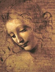
Leonardo Da Vinci. Head of Woman, 1508. Oil, earth, and white lead pigments on poplar. The Metropolitan Museum of Art, New York City, New York.

Frida Kahlo. Self Portrait II, Dedicated to Dr. Eloesser, 1940. Oil on masonite. Frida Kahlo Museum, Mexico City, Mexico.
|
Planning
|
As I had been searching for portraits that would light up my inspiration, I decided to sketch out the chosen portraits just to look at them side to side, and see if I could keep some of the same aspects, or cut out some unnecessary features. I also took note of the meanings of each of the pieces, and tried to create my own meaning, |
|
|
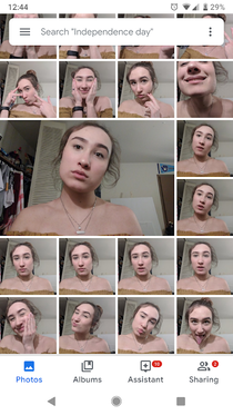
I had been unsure of the type of facial expression that I wanted to use, because there were so many feelings to convey. I experimented by taking TONS of photos of myself with different expressions, even in different lighting. I ended up goofing around most of the time which gave me about 200 rough photos to sort through. This was probably my favorite part of planning my piece as I got creative, and I got a feel for what I wanted to convey through my piece. |
|
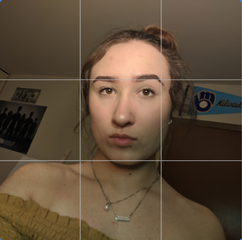
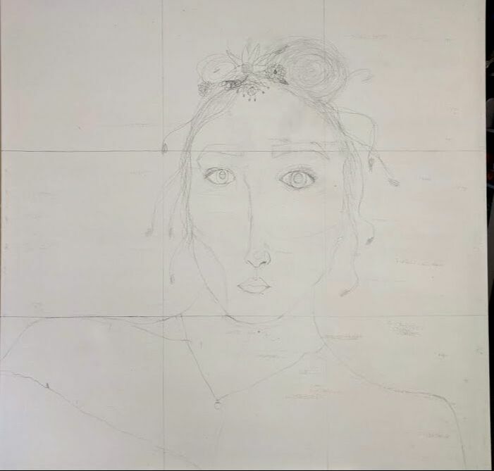
I found my photo inspiration after running through trial and error multiple times. I decided not to sketch it into my planning process, as it was going to be a direct sketch onto the canvas. This is why I placed a grid over my final image inspiration. |
|
Process
|
|
|
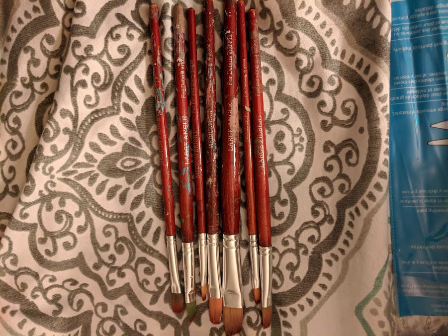
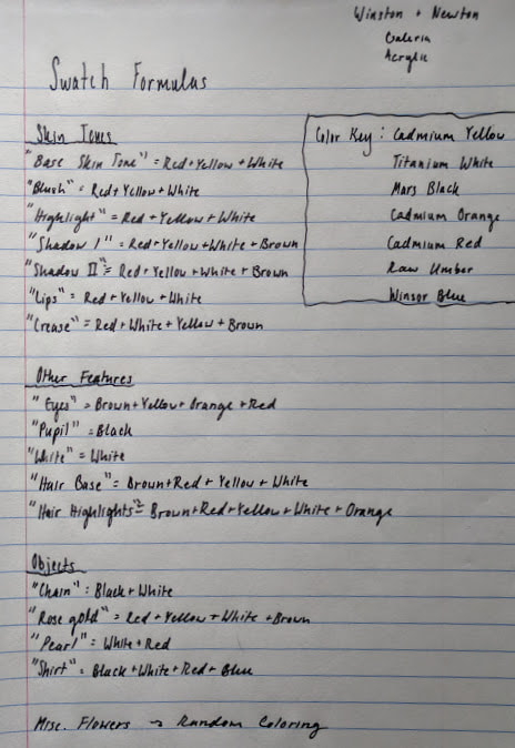
During the painting process, I used a multitude of brushes, and mixed many colors. I used the Small & Medium Bright for fill and sharp edges when it came to painting my background. I also used the Large angle to fill in the blank parts of my background. I used the Medium & Large Filbert for blending and coverage when mashing skin tones. Lastly, I used the Small & Medium Mop good for painting washes when I started off with my base colors. When creating base colors, I often took those colors and made shadow/highlight tones with them since they had to be somewhat similar. I used Winston & Newton Galeria Acrylic paints to create my piece in the hues cadmium yellow, cadmium orange, cadmium red, titanium white, mars black, raw umber, and winsor blue. I mixed these colors together often to create the hues that I utilized in my final piece.
When it came to stretching my canvas, I used a 3ft x 3ft frame, staples, a hammer, and canvas material that was provided for me by the art teacher. I also used gesso provided by my instructor before beginning my painting process.
When it came to stretching my canvas, I used a 3ft x 3ft frame, staples, a hammer, and canvas material that was provided for me by the art teacher. I also used gesso provided by my instructor before beginning my painting process.
|
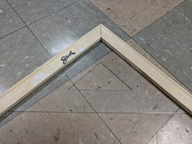
Stretching the canvas was the first step of creating my piece, and I did this by snapping four 3ft pieces of wooden frame together, then taking a triangle square to measure out the 90 degree angles. I placed the 90 degree angle of the triangle square into each corner, to make sure that they were even, making a perfect square.
|
|
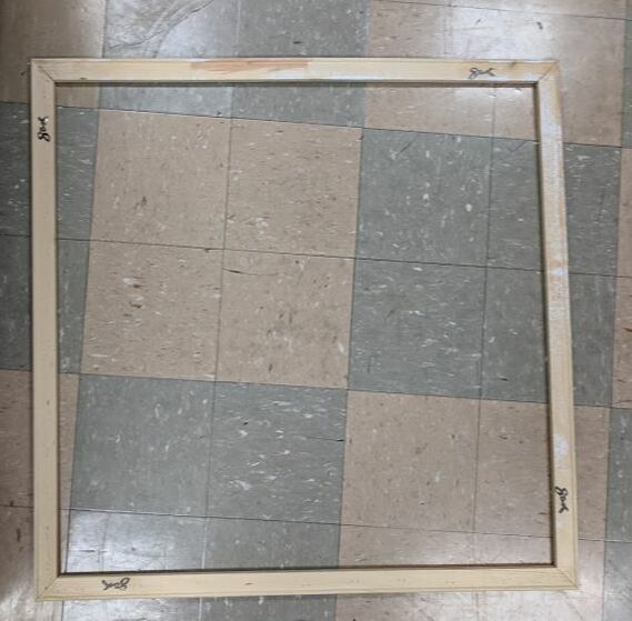
Once I was sure that each angle equaled 90 degrees, I used the staple gun to connect the frames together sturdily where I had snapped them in place. Sometimes the staples would be loose, but I fixed that by lightly hammering the staples back into the frame. |
|
|
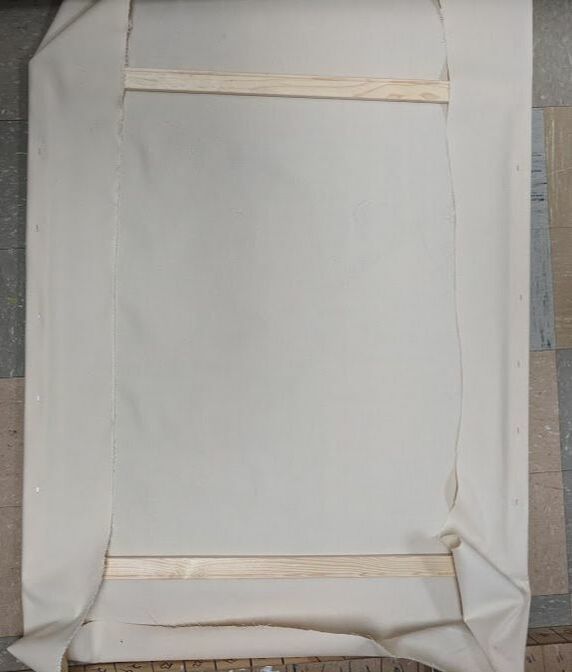
Once the frame was put together, it was time to stretch the canvas material onto the frame. I rolled out the canvas and placed my frame staple-side up on top of the material. I left about five inches of material loose on each edge, to ensure that I had enough canvas material. Then I folded the canvas over the edge of one side, and stretched the canvas so that it would not be too tight nor loose. I stapled the canvas to the frame about six times on each side. I repeated this process for the remaining three sides. |
|
The corners also needed to be folded, not to bulge out nor cause a fold on the outer corners of the frame. I stapled the corners down about eight times. Once again, if there had been loose staples, I lightly hammered them down. Once everything was stapled down, I cut off the excess materials and discarded them. |
|
|
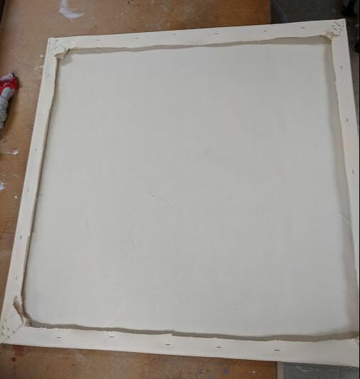
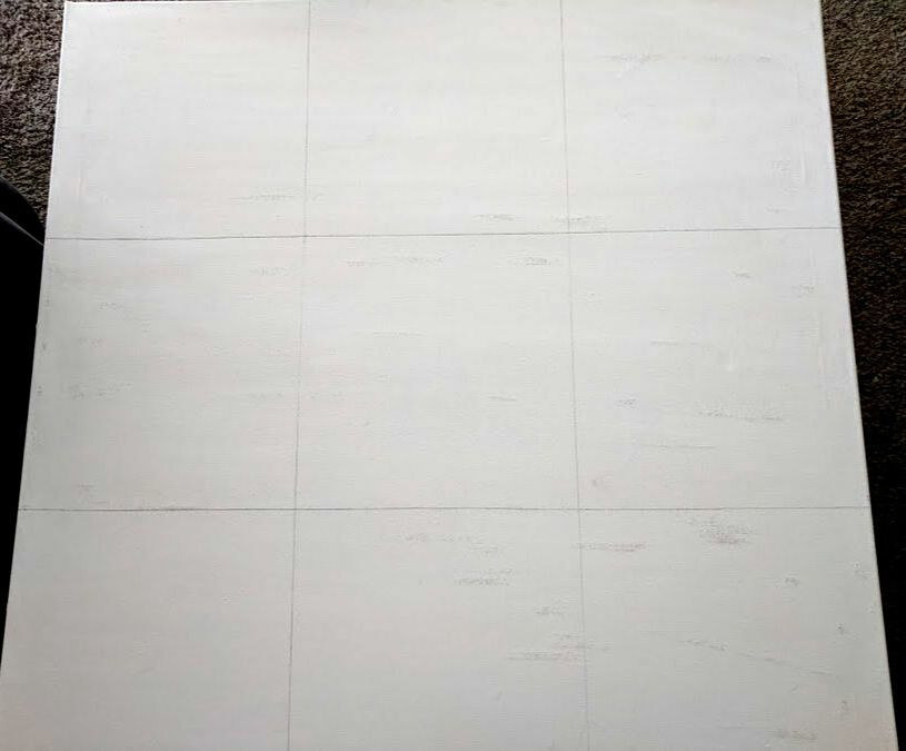
Once my canvas was stretched, I used Trueflow white acrylic gesso to smooth out the material. I put two layers over the canvas, to ensure that my acrylic paints would be applied in a smooth manner. Once the gesso had dried, I put a grid on my canvas that would be in proportion with the grid that had been placed over my digital image. |
|
I free handed my image onto the canvas in reference of each square of my digital image. I prefer free-handing, but I feel it would've been a better idea to project my image onto the canvas, to be more precise. My face could've been more symmetrical and not as elongated if I was more precise in my sketching method. |
|
|
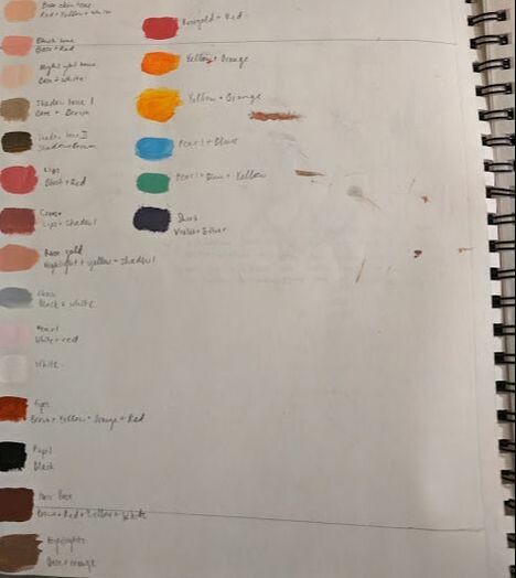
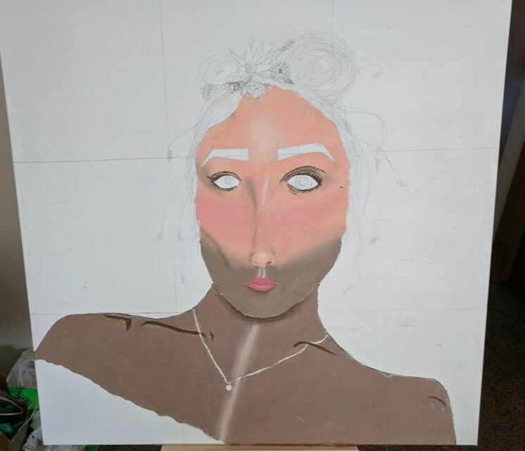
I started my painting by working with my skin tones and the shadow, as I knew it was going to take the longest amount of time and focus. I used the medium mop to fill in portions of my face, and I used the medium & large filbert brush to blend these tones together. This part required a lot of blending, which I don't have much skill for. If I took a couple more days on this piece, I could've made the tones softer, and not as bright and sharp. The dried acrylic tones happened to have more contrast than the wet acrylic, which had been closer to my actual skin tone. The colors that I had used for my base, blush, and highlights consisted of cadmium red, cadmium yellow, and titanium white. I added raw umber to my shadow tones.
|
|
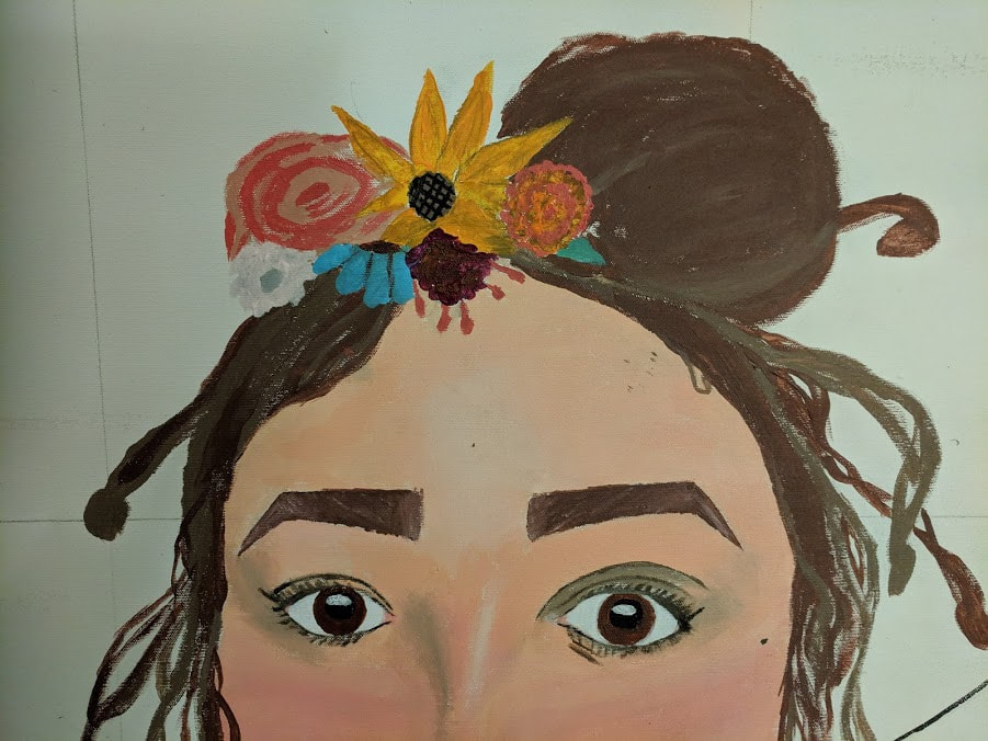
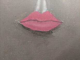
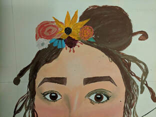
Once I had dealt with the blending and coloration problems with my body, I worked with smaller details like my eyes & eyebrows, lips, and hair. These aspects didn't require much blending, but I did mix multiple hues for painting with my original bases. For my hair, I used the same formula as my shadows, but adding more cadmium red. I also added more white to my hair tone to create my natural highlights. I lightly brushed the highlight tone into my hair flow with a small bright brush. I used the small and medium mop for many other small details, like the flowers in my hair.
|
|
|
The last part of my portrait that I focused on was the background. I made the background simple by separating the bright part of my piece with titanium white, and the shadow area of my piece with mars black. I filled in these areas with a large angle brush, since no blending needed to take place. I relied on the background to express my idea of light shining through the darkness. This completed my piece. |
Experimentation
|
|
All the experimentation that had taken place consisted of my use of different hues. I basically mixed random paints to create the "right" skin tones, hair tones, and vibrant hues for the flowers. When using the paints, I also had to practice my blending. Even though I have blended acrylics in the past, it still feels like an experiment to me: how much paint should be added, when I should stop moving the paints. It was a challenge for me through and through.
Reflecting & Critiquing

Leonardo Da Vinci. Head of Woman, 1508. Oil, earth, and white lead pigments on poplar. The Metropolitan Museum of Art, New York City, New York.
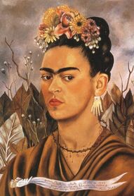
Frida Kahlo. Self Portrait II, Dedicated to Dr. Eloesser, 1940. Oil on masonite. Frida Kahlo Museum, Mexico City, Mexico.
|
Similarities:
Differences:
|
Critique
This piece took a lot of my time and energy, but I also feel like I could've improved it more. I feel that this piece could've been more realistic if I could've worked more with my shadowing, so that my face wouldn't look as muddy as it does. Using a projector would've also been a more wise decision, as my facial features would've been more realistic. My nose is very elongated, and my eyes both different sizes, which they were not in my inspiration photo. These are just improvements that I can make in the future. I was satisfied with my use of color, and although I had felt uncomfortable with my blending abilities, it didn't turn out horribly. Overall, this piece had it's flaws, but I feel that I look somewhat similar to the final outcome. |
ACT Connections
Clearly explain how you are able to identify the cause effect relationship between your inspiration and its effect on your artwork:
Head of Woman and Self Portrait II definitely impacted my final piece visually. I felt there wasn't much meaning to my inspirations, despite my interest in their appearances.
What is the overall approach the author has regarding the topic of your inspiration?
The only helpful information that I was able to take in was that Frida Kahlo created her self portrait for a friend of hers, and Da Vinci created his piece for a women.
What kind of generalizations and conclusions have you discovered about people, ideas, culture, etc. while you researched your inspiration?
I learned that many of Kahlo's pieces revolved around her pain and suppression. She also incorporates a lot of her culture. Many artists work in their culture, sometimes not even realizing it.
What is the central idea or theme around your inspirational research?
I had only wanted something to express my feelings of working out of a dark place, into the light. Moving away from negativity.
What kind of inferences did you make while reading your research?
I inferred that self portraits often tell a story out of the use of facial expressions.
Bibliography
Head of a Woman. (n.d.). Retrieved from https://www.metmuseum.org/art/collection/search/656458
Self Portrait, Dedicated to Dr Eloesser, 1940 by Frida Kahlo. (n.d.). Retrieved from https://www.fridakahlo.org/self-portrait-dedicated-to-dr-eloesser.jsp
What Materials Was Frida Kahlo's Art Made With? (2011, June 07). Retrieved from https://www.ehow.com/info_8557327_materials-frida-kahlos-art-made.html
